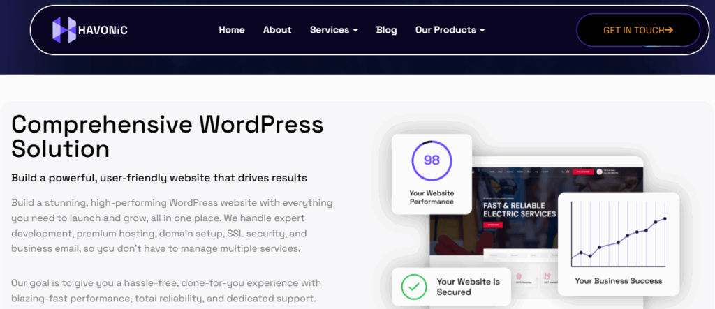
In today’s digital-first world, your website is more than simply a digital business card; it is your storefront, salesperson, and first impression all in one. But here’s the catch: your audience isn’t just sitting behind their computers anymore. They are browsing on smartphones, tablets, laptops, and even smart TVs. If your website does not adapt fluidly to all devices, you are not just providing a poor customer experience, but also losing money.
This post delves deeply into what it means to have a fully responsive design that works seamlessly across all devices, as well as how to achieve it without the hassle.
Your Website Looks Great, But Only on Your Screen
You might think your site looks stunning on your laptop—and it probably does. But what happens when someone visits it on a mobile phone with one hand while commuting? If your layout breaks, text overflows, or navigation becomes a puzzle, they’ll bounce within seconds.
A desktop-only approach alienates more than half your audience. With mobile traffic accounting for over 60% of global web traffic, a site that only shines on large screens is practically invisible on the internet’s frontlines.

The Device Diversity Dilemma—From Phones to 4K Monitors
From tiny smartphone screens to ultra-wide desktop monitors, your visitors come with varying expectations. Responsive design isn’t about shrinking content—it’s about smartly adapting content so it looks intentional and user-friendly at every size. That’s the challenge. But also, that’s the opportunity.
The Hidden Cost of a Non-Responsive Website
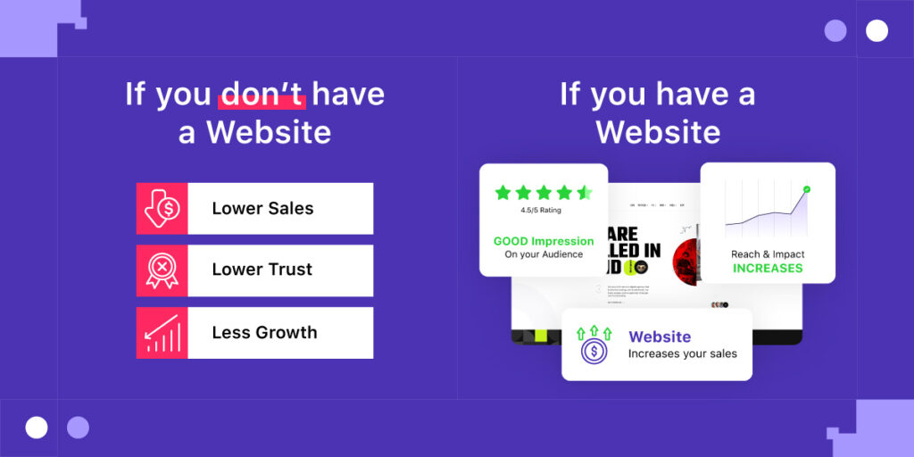
If your bounce rate is mysteriously high, a non-responsive layout could be to blame. Visitors won’t always complain—they’ll just leave. That silent departure results in lost leads, abandoned carts, and unrealized conversions.
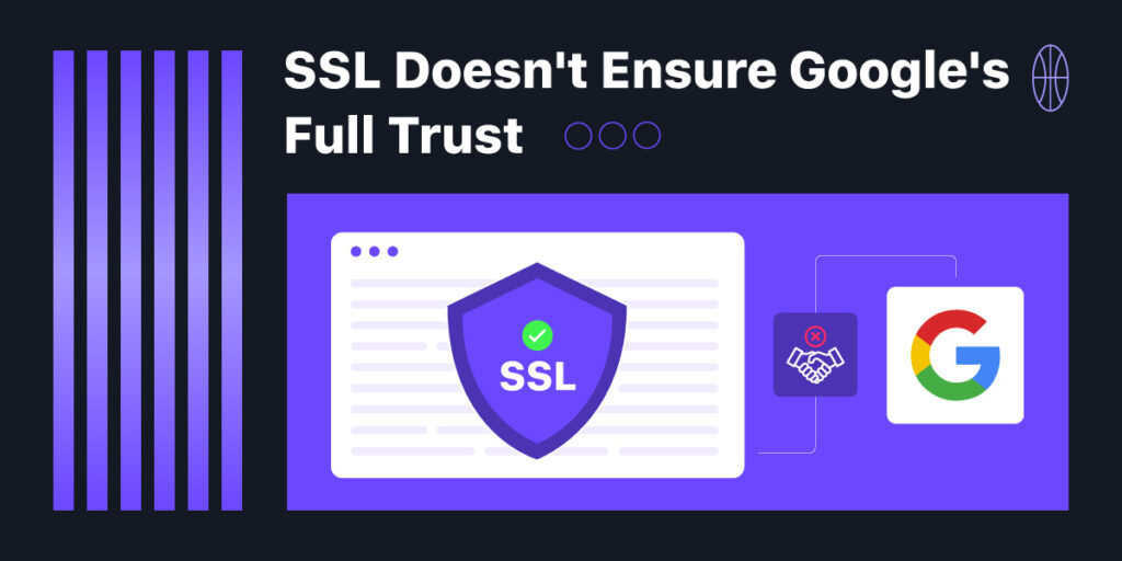
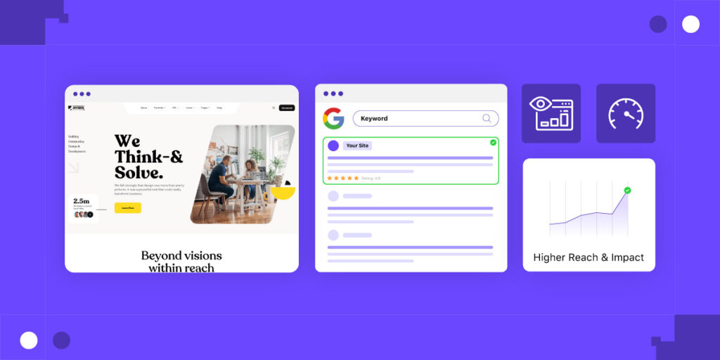
SEO Rankings Tank When You Don’t Optimize
Google prioritizes mobile-first indexing, meaning that your site’s mobile version determines your search rankings. A poor mobile experience = poor visibility. That’s a steep price to pay for not optimizing your design.
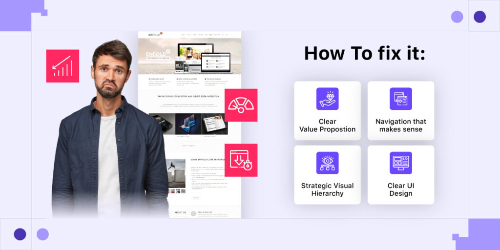
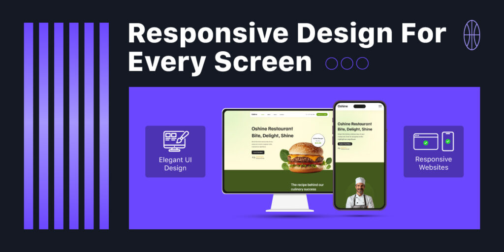
What “Winning” Responsive Design Looks Like
Winning responsive design uses fluid grids that scale content proportionally, not rigidly. Images resize intelligently without distortion, and text reflows smoothly for optimal readability.

Seamless UX from Tap to Click
Navigation should feel natural, whether you’re using a mouse or a thumb. Great responsive design eliminates friction—it anticipates how users interact on each device and adjusts accordingly.
Fast Loading Times Across Devices (Yes, That Matters Too)
Speed isn’t just a bonus—it’s a necessity. Compressed images, optimized assets, and mobile-first loading all contribute to a responsive site that feels snappy, no matter the screen size.
How Havonic Builds Responsive Websites That Just Work
Havonic creates websites using a mobile-first strategy to ensure consistent performance across all devices. Using current frameworks, clean code, and smart design techniques, we create fast, adaptable, and visually consistent sites that improve user experience, increase engagement, and seamlessly adapt to future devices—no redesigns or headaches necessary.
Mobile-First Strategy Backed by Modern Frameworks
At Havonic, we start with mobile, not as an afterthought, but as the foundation. Our developers use mobile-first frameworks to ensure your site is lightweight, snappy, and fully optimized for smaller screens before scaling up.
Pixel-Perfect Design Across All Devices
We don’t settle for “close enough.” Every design is meticulously crafted to maintain visual harmony across phones, tablets, laptops, and desktops. That means consistent spacing, perfect alignment, and no weird surprises.
Built-In Speed, Security, and Flexibility by Default
Havonic websites are responsive and high-performing. From clean code and smart caching to SEO-friendly architecture, we deliver sites that look beautiful and load fast, without compromising on flexibility or function.
Whether you’re launching a brand-new site or upgrading an outdated one, we handle everything from design to deployment, so you can focus on running your business.
Brand Consistency Without Compromise
Whether on an iPhone or a desktop, your brand should feel familiar. That means consistent use of logos, icons, and color schemes—even when the layout changes.
Typography that’s readable on a 27” monitor can become microscopic on a smartphone. A responsive framework ensures your visual identity remains sharp and legible at all scales.
Tools and Frameworks That Make Responsive Easier
Modern tools like Bootstrap, Tailwind CSS, and CSS Grid offer a solid foundation for building responsive layouts quickly and efficiently. They simplify the development process without compromising on design.
Common Mistakes to Avoid in Responsive Design
- Designing for desktop first and retrofitting later
- Ignoring image optimization
- Hiding content instead of reformatting it
- Forgetting about real device testing
These pitfalls can sabotage even the best intentions, so keep them in check.
Conclusion
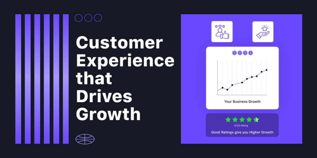
A responsive website isn’t a trend—it’s a necessity. If you’re serious about growing your brand, reaching more users, and converting visits into revenue, responsive design isn’t optional. It’s your competitive edge.
Happy users stay longer, explore more, and come back often. Search engines reward that behavior with higher rankings. It’s a win-win, and it starts with responsive design that works everywhere.
Let Havonic help you build a web experience that wins across the board. Contact us today and let’s make your vision responsive.