The digital entrance to your company is your homepage, where visitor journeys start, trust is established, and first impressions are formed. Users make snap decisions on whether to stay or go depending on their feelings and what they observe in a matter of seconds. A well-designed homepage sets the tone for your entire business, clearly communicates your value, and encourages visitors to take action. If it is inadequate, you run the danger of losing prospective clients before they have had a chance to consider what you have to offer
It’s the First (and Maybe Only) Impression
Your homepage is the first place most visitors land. Before they ever read about your products, see your reviews, or explore your offerings, they judge your entire brand by that one screen. This judgment happens in seconds, sometimes even milliseconds.
If your homepage feels outdated, slow, confusing, or cluttered, visitors won’t give you a second chance. They won’t take the time to see if your services are good. They’ll click away and head to a competitor with a cleaner, faster, and more intuitive website.
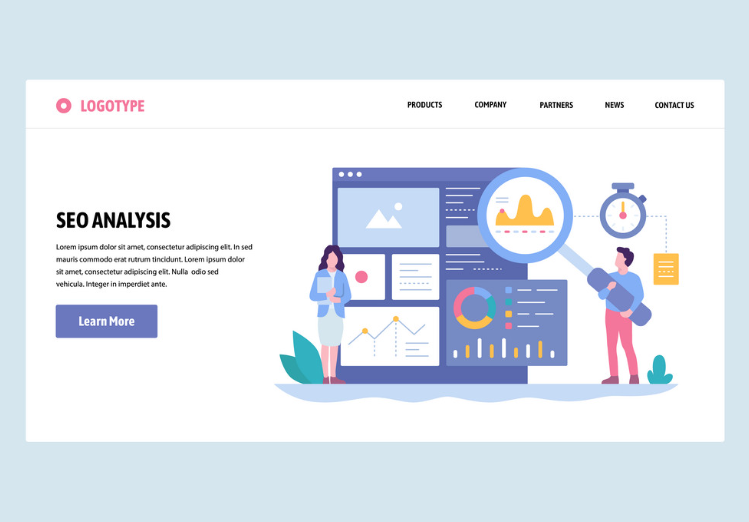
It’s the Digital Door to Every Customer Journey
Think of your homepage as the lobby to your business. Whether someone comes from an ad, a search engine, or a direct link, they often start here. If your homepage doesn’t guide them to the next step—like viewing products, booking a call, or reading about your services you’re losing them before they ever begin the journey.
Conversions Start with Clarity
People don’t convert when they’re confused. If your homepage fails to immediately explain who you are, what you offer, and what visitors should do next, they’ll bounce. Conversions don’t just depend on clever marketing; they depend on clarity. And clarity starts at the homepage.
The Common Mistakes That Are Hurting Your Homepage
A lot of homepages fall short because they attempt to express too little or do too much. Common errors that mislead and alienate visitors include cluttered layouts, ambiguous messages, and subpar mobile design. These mistakes can cost you important leads before they even interact, thereby undermining your reputation and conversions.
Overloading It With Too Much Information
A homepage is not your About page, your pricing page, and your product catalog rolled into one. Trying to say everything at once overwhelms visitors. Too many headlines, calls to action, and features create decision fatigue.
Instead, your homepage should function as a focused hub that introduces your brand and directs people where they need to go, quickly and simply.
Being Vague or Generic
Phrases like “Innovative solutions for the future of business” sound impressive but mean nothing. If someone lands on your homepage and doesn’t instantly understand what you offer and who it’s for, they’ll leave.
Strong homepages use specific, benefit-driven language. Tell visitors exactly what you do and how it helps them, without buzzwords.
Slow Load Times and Poor Mobile Experience
If your homepage loads slowly or isn’t mobile-friendly, most visitors will never stick around to see your content. With over half of all web traffic coming from mobile devices, an unresponsive homepage immediately alienates a massive chunk of your audience.
Speed, layout, and touch-friendly design aren’t “nice to have”—they’re make-or-break essentials for today’s digital users.
What a High-Performing Homepage Looks Like
Clear, targeted, and easy to use are characteristics of a high-performing homepage. It conveys your value right away, provides users with easy-to-use navigation, and motivates action with strategically placed calls to action. It keeps users interested and encourages meaningful conversions with its simple design, quick loading time, and trust-building components.
A Clear Value Proposition at the Top
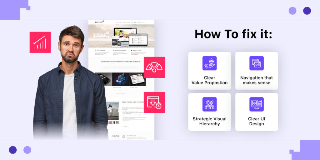
Your homepage should begin with a strong, direct headline that communicates your main value proposition. This is not the place for poetic statements or vague mission slogans. Visitors should instantly understand what you offer and why it matters to them.
Beneath that, a subheadline can add detail, followed by a prominent call-to-action button that invites users to take the next step, sign up, book a call, or view products.
Navigation That Makes Sense
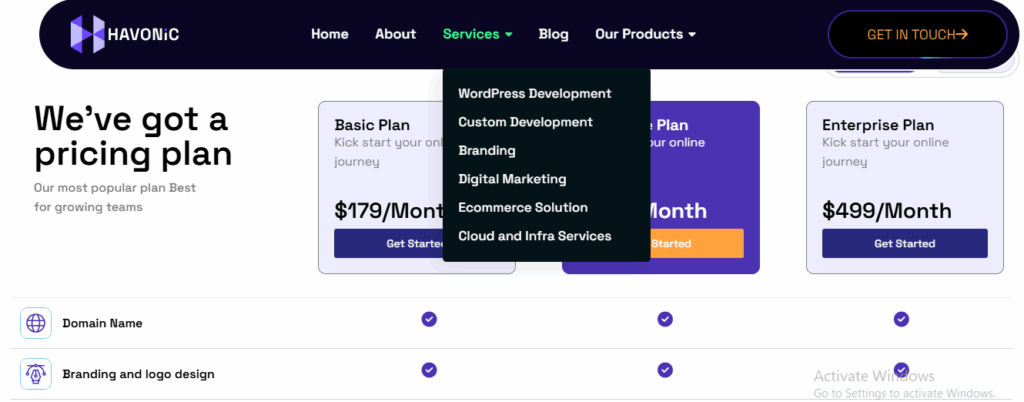
Keep your menu clean and intuitive. Ideally, it should have 5–6 main links max. Too many options overwhelm visitors and increase friction. Make sure your most important pages, like Services, Pricing, About, and Contact, are easy to find from the homepage.
Avoid drop-downs with layers of sub-links unless necessary. Every click is a potential exit.
Strategic Visual Hierarchy
Your homepage should visually guide users down the page, from most important to least. Use whitespace, headings, and color contrast to draw attention to key elements. This includes your:
- Primary offer or headline
- Trust-building elements (testimonials, client logos, stats)
- CTAs are placed strategically throughout the scroll
Each section should naturally flow into the next, encouraging users to stay and explore.
How to Build Trust With Homepage Content
Clear, truthful messaging and real human components are the first steps in developing trust on your homepage. Visitors are more likely to trust your business when you have testimonials, identifiable client logos, secure browsing signals, and clear information. Users are more inclined to stick around, explore, and take significant action when they have faith in what they see.
Use Social Proof Early
Displaying client logos, testimonials, or press mentions in the first scroll helps create instant credibility. You don’t need a long case study—just a row of trusted brands or a single, punchy quote from a satisfied customer is enough to boost trust.
Humans are wired to follow social signals. If your homepage looks like others already trust you, new visitors are more likely to do the same.
Be Transparent and Human
Include a short “About” snippet or a founder’s message that feels personal. People connect with people. Even in a tech-driven world, human language and relatable imagery matter.
Avoid faceless jargon. Show real people, real outcomes, and real intent. This makes your brand feel approachable and trustworthy.
Include Key Trust Signals
Simple things like SSL certificates, clear contact info, live chat buttons, and privacy assurances go a long way in convincing visitors that your business is legitimate and secure.
Also, if you offer guarantees, free returns, or satisfaction policies, highlight them. Reassurance is key—especially for first-time visitors.
Developing a Homepage That Encourages User Engagement
More than just providing information, your homepage should guide visitors to a particular objective. Step-by-step navigation, strategic design, and obvious calls to action lead visitors through the entire process. Passive visitors become engaged users who convert, ask questions, or continue exploring when your homepage is designed with action in mind.
Keep CTAs Simple and Focused
Every homepage needs a primary call to action. Whether it’s “Get a Quote,” “Start Your Free Trial,” or “Shop Now,” make it unmissable and repeat throughout the page. Use action-oriented language that tells the visitor exactly what to expect.

Don’t clutter your homepage with five different CTAs. Focus on one core action and support it throughout.
Offer a Path for Every Type of Visitor
Not all visitors are ready to buy. That’s why your homepage should offer multiple paths based on visitor intent:
- Ready to purchase? Show them “Shop Now” or “Get Started.”
- Still researching? Offer “Learn More” or “How It Works.”
- Need support? Display “Talk to an Expert” or “Contact Us.”
Each type of visitor should feel seen and directed.
Test and Improve Based on Behavior
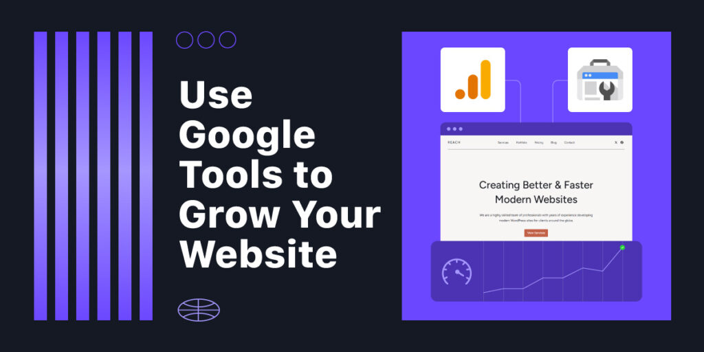
Use tools like Google Analytics and heatmaps to track how users interact with your homepage. Are they scrolling? Clicking? Ignoring certain sections?
Small tweaks based on real behavior, like moving a CTA higher or rewording a headline, can dramatically boost conversions.
Homepage Performance Essentials You Can’t Ignore
For visitors to stay interested, your homepage needs to function flawlessly. Accessibility, responsiveness on mobile devices, and quick loading times are essential. These technological prerequisites provide a seamless user experience on all platforms. Ignoring them can harm your brand’s reputation and conversion potential by increasing bounce rates, decreasing search ranks, and eroding trust.
Speed Optimization
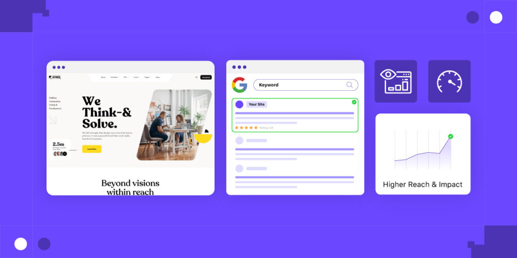
Compress images, reduce unnecessary scripts, and choose reliable hosting. A slow homepage not only loses visitors, it also damages your SEO rankings. Aim for load times under 3 seconds.
Mobile Responsiveness
Your homepage must look and function beautifully on every screen size. That means buttons should be tap-friendly, fonts should be legible, and scrolling should feel natural.
Test on multiple devices—not just your desktop. What looks perfect on a laptop might break completely on a phone.
Accessibility Matters
Make sure your homepage meets accessibility standards (like WCAG). Use readable contrast, provide alt text for images, and enable keyboard navigation. An inclusive homepage helps you reach more users and avoid legal risk.
Conclusion
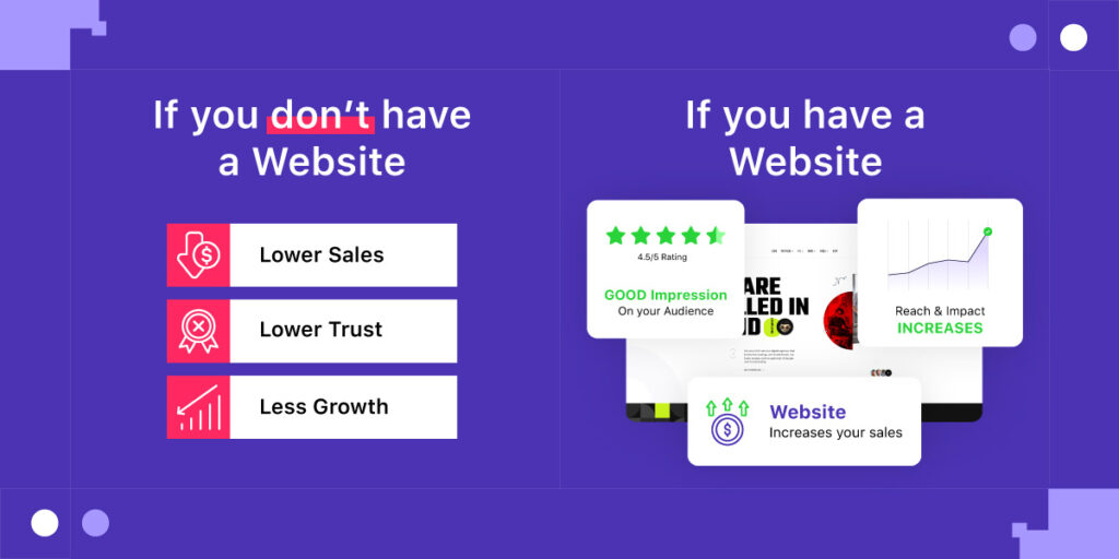
Your homepage isn’t just a place people land it’s where they decide to trust you or leave forever. If it’s cluttered, unclear, or outdated, it’s silently killing your business growth.
But the good news? It doesn’t take a full redesign to fix it. With clarity, simplicity, and intention, you can turn your homepage into a true conversion engine.
Start by asking yourself:
- Does my homepage clearly say what I do?
- Does it guide users to a specific next step?
- Does it build trust and load fast across devices?
If the answer to any of those is no, it’s time to take action. Because in the digital world, business growth starts with a single click. Make sure your homepage earns it.
