In a world where digital impressions happen in seconds, your visual identity is no longer optional; it is required. You’re not just battling for attention but for identification in an atmosphere where everyone wants to be noticed. Before your audience reads a word or hears your message, they are already formulating opinions based on their observations. Your design becomes a silent introduction, a visual greeting that either attracts or repels people. A weak or irregular brand identity might mislead or dissuade potential clients, but a powerful, strategic design immediately communicates trust, professionalism, and personality.
The Psychology Behind First Impressions
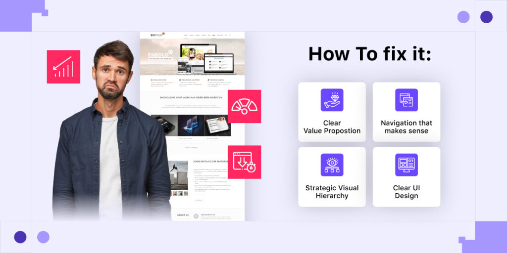
Humans can make rapid decisions, and the digital world fuels this instinct. When someone visits your website or sees your product for the first time, they immediately create an opinion, often in an instant. This reaction is instinctive and emotional, motivated by how the design makes individuals feel. Visuals that appear outdated, messy, or unclear give a silent message that they are unprofessional, untrustworthy, or irrelevant. That represents the expensive cost of a poor first impression. On the other hand, clean, sleek, and thoughtful design establishes instant credibility and welcomes trust.
How Design Shapes Perception in Seconds
Your brand’s first impression is determined by its design, which speaks before you do. Within seconds, your audience forms an impression based solely on how your graphics appear and feel. A clean, accurate design communicates professionalism, attention to detail, and credibility. It informs visitors that they can expect a flawless and trustworthy experience.
Combining Visuals With Brand Vision
Your design must reflect your brand’s mission, whether it is to empower, educate, inspire, or entertain. Every color, shape, and visual element should reinforce the message you wish to convey. When your design is consistent with your mission, your audience will immediately understand what you stand for. However, if your pictures provide contradictory signals, you risk confusing or alienating the people you want to attract.
Know Your Audience Before Choosing a Color
Design isn’t about your personal preferences; it’s about creating something that resonates with your audience. Before you choose colors or fonts, consider who you’re communicating with and what interests them.
Identifying Your Ideal Client
Effective design begins with a thorough understanding. Go beyond basic statistics to discover what genuinely matters to your target audience: their goals, frustrations, dreams, and anxieties. Which obstacles do they face? What drives their decisions? These emotional insights lay the groundwork for producing pictures that are both unique and relevant. When your design mirrors their perspective and addresses their essential needs, it creates an immediate connection and trust. You’re not just decorating; you’re communicating. Knowing what matters most to your ideal consumer allows you to create a brand experience that seems thoughtful, personable, and tailored just to them.

Creating Visuals That Resonate Deeply
Empathy is the foundation of connection-based design. When your images reflect your target audience’s values, lifestyle, and objectives, they form an instant connection with your brand. A streamlined, minimalist layout may appeal to busy professionals who value clarity, yet bold, expressive visuals might energize creative entrepreneurs seeking innovation. The idea is to make your audience feel recognized and understood. Every design decision, from images to composition, should serve one goal: to emotionally connect the audience. When people see themselves in your graphics, they are much more inclined to trust, recall, and engage with your business on a deeper level.
Colors that speak louder than words.
Color communicates, not just decorates. Each color inspires emotion and influences thinking, often without conscious thinking. Blue can represent trust and relaxation, whereas red indicates intensity or haste. Your brand’s color palette should correspond to the emotional response you want to elicit. Color is used thoughtfully to direct conduct, show personality, and increase recognition. When colors are chosen with purpose, they become a powerful silent collaborator in your brand’s storytelling. Allow your colors to speak for you when it comes to comforting, energizing, and inspiring. In the field of design, emotion is frequently the most powerful language.
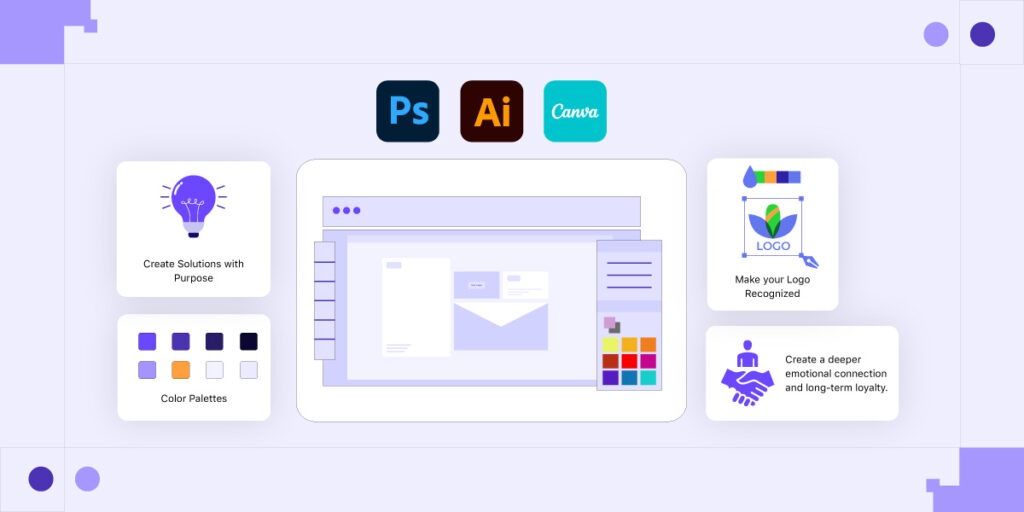
Choosing a Palette that Represents Your Values
Color should tell a story, not follow a trend. Instead of chasing what’s popular, choose shades that embody your brand’s mission, voice, and personality. Whether you value innovation, calm, boldness, or sustainability, your palette should visually echo those ideals. When your colors feel intentional and aligned, they create a sense of harmony and trust. A well-matched palette not only enhances brand recognition but also reinforces your authenticity. People can feel when visuals and values don’t match—and that disconnect weakens your message. Let your colors reflect who you are, not just what’s trending in the moment.

Avoiding Common Color Mistakes.
Color may either improve or detract from your brand’s image. Many organizations make the mistake of using colors that clash, overwhelm, or do not match their brand identity. A bright palette may appear appealing, but if it causes eye strain or disorientation, it backfires. One of the most disregarded concerns is accessibility. If your writing blends into the background or lacks contrast, it is unreadable, particularly for those with visual impairments. Colors may display differently across screens, so try your palette on numerous devices. Consistency, clarity, and usability should be the guiding principles for all color decisions.
Avoiding Common Color Mistakes.
Trendy fonts might look stylish at first glance, but if your audience can’t read your message clearly, they won’t stick around. The goal of typography is communication, not decoration. Always choose fonts that maintain clarity across all platforms—whether it’s a smartphone screen, website header, or printed material. Readability builds trust and ensures your brand looks polished and professional everywhere it appears. Consistency in font use also strengthens recognition. When your typefaces are easy to read and aligned with your brand personality, you strike the perfect balance between style and functionality, without sacrificing the message you need to deliver.
Minimalism vs. Minimalism in Modern Design
Minimalist logos can be timeless and clean. Maximalist logos can be bold and unique. The best option isn’t about trends, it’s about what visually communicates your brand essence.
| Sr No. | Aspects | Minimalism | Minimalism |
| 1 | Design Style | Clean, simple, and uncluttered | Bold, layered, and expressive |
| 2 | Color Palette | Neutral tones, limited color use | Vibrant, diverse, and rich color combinations |
| 3 | Typography | Simple, readable fonts with lots of spacing | Decorative, experimental fonts with a strong presence |
| 4 | User Experience | Easy to navigate and digest quickly | Visually rich, encourages exploration |
| 5 | Trend Influence | Timeless and classic | Trend-forward and attention-grabbing |
| 6 | Ideal For | Financial firms, luxury brands, and wellness products | Art brands, fashion, entertainment, and startups |
Difference Between Generic and Genuine Visuals
Your audience is more visually smart than ever, and they can recognize inauthentic pictures right away. Generic stock photographs with forced grins, antiseptic surroundings, or too polished scenes may make your company appear cold or distant. People are more likely to connect with honesty, emotion, and relatability than with perfection. Choose photographs that feel authentic, such as honest moments, natural expressions, or scenes that mirror your audience’s world. Genuine graphics increase trust and make your business more approachable. When consumers recognize themselves in your picture, they are much more likely to interact and retain your message.
How Photography Styles Communicate Brand Personality.
Photography is more than simply a visual filler—it’s a storytelling tool that influences how your brand is perceived. Whether your photographs are soft and airy, moody and dramatic, bright and lively, or sleek and futuristic, each conveys a particular emotional message. A light, natural style may convey warmth and openness, but a dark, dramatic design might convey elegance and depth. The objective is to maintain consistency. When your photography style is consistent with your brand voice, it strengthens your identity and increases emotional clarity. Choose a tone that reflects your brand’s beliefs, and use every image to promote the experience you promise.
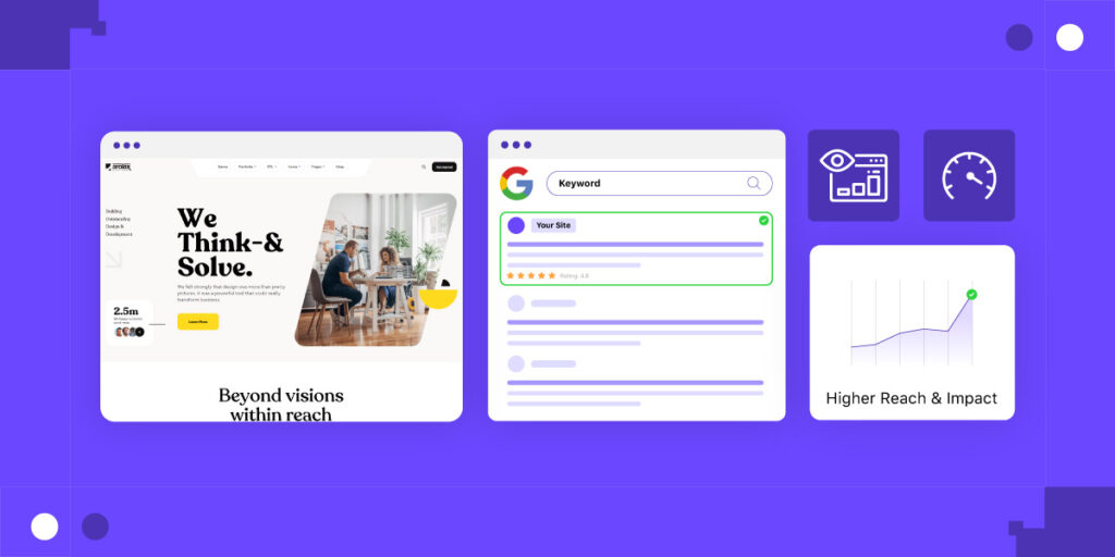
Transforming Visual Design into Clicks and Conversions.
Good design does more than just look great; it inspires people to act. The strategic use of layout, spacing, and visual hierarchy directs the viewer’s attention to the most important actions. Clear calls to action, strategically positioned buttons, and plenty of whitespace help your message to breathe and stand out. Remove any distractions that dilute your aim. When people can easily browse your page and know where to click next, conversion rates increase. The secret is not showy graphics, but thoughtful design that encourages behavior. Make every aspect have a function, and you’ll translate visual appeal into measurable outcomes.
Every color, font, and shape should convey a story.
Your visual identity should reflect the heart of your brand. A tech startup may employ strong typography and edgy color schemes to communicate innovation. A wellness brand, on the other hand, could use soothing colors and gentle curves to convey care and comfort. Every visual choice, from the shape of a button to the color of the background, conveys a message. Design speaks long before words do. That is why it is critical to ensure that your visual design and brand language are consistent. Make each color, typography, and layout element a character in your brand’s tale, one that speaks to your target audience.
Conclusion
Design is more than just making things look attractive. It’s about getting folks to feel something. It’s your brand’s unconscious language—the way it introduces itself, communicates its narrative, and makes a lasting impact without saying a word. Great design evokes emotion, fosters trust, and prompts recognition. It connects your graphics with your words, resulting in a clear and confident presence. When your design appears intentional, your audience feels understood. The emotional connection is what converts casual viewers into repeat consumers. It’s the unspoken handshake that convinces them, “This brand gets me.