A beautifully designed website might capture attention, but it doesn’t guarantee trust. In today’s digital landscape, trust is the foundation upon which visitors decide to engage, subscribe, or buy. First impressions are formed within seconds, not just based on design quality, but on subtle signals that communicate legitimacy, reliability, and professionalism.
You could have stunning visuals, fast load times, and modern layouts, yet still drive visitors away if your site doesn’t feel credible. This post explores the often-overlooked elements that impact trust and shows you how to bridge the gap between looking good and being trusted.
Why Trust Matters More Than Ever in 2025
In 2025, online users are more suspicious and selective than ever before. With scams, hacking, and AI-generated material on the rise, customers want transparency, authenticity, and security from the websites they visit. A visually pleasing design is no longer enough; visitors must believe that your website is legitimate and trustworthy. Trust has become an important aspect in determining whether users engage, buy, or leave. Building and retaining trust is now an essential component of every digital brand’s success.

First Impressions Are Made in Seconds
The average user decides whether to stay or leave a website within the first 5–10 seconds. During that blink-fast judgment window, they’re not just noticing your color scheme or hero image—they’re scanning for signs of authenticity. Does the site feel real? Does it look like it’s backed by a legitimate business? Is it easy to navigate, or does something feel off?
Every pixel and every word is being quietly evaluated. If something—even a small detail—seems outdated, inconsistent, or sketchy, trust starts to erode.
Trust Influences Every Key Metric
The impact of trust—or the lack of it—shows up in every major website performance metric:
- Bounce rates rise when users feel uncertain or confused
- Conversion rates suffer when forms or checkout flows lack credibility cues
- Time on site drops when users can’t immediately sense value or professionalism
- Referral behavior disappears when users don’t feel confident sharing your site
The truth is, design draws them in—but trust keeps them there. It transforms a curious visitor into a confident customer.
The Hidden Trust-Builders Most Websites Overlook
Many websites focus on design but overlook subtle characteristics that foster genuine trust. From consistent branding to clear messaging and apparent security indications, these seemingly insignificant things discreetly calm visitors. When done correctly, they provide a seamless, credible experience that gives users confidence in dealing with your company.
1. Consistent Branding Across All Pages
Uniform branding signals organization, care, and attention to detail—all traits that consumers associate with professional businesses. When your logo changes in size across pages, when colors clash, or when the tone of voice shifts between tabs, it sends a message: something’s not quite right.
A consistent visual identity (logo placement, typography, color palette) and tone (formal, friendly, expert, etc.) create a seamless and reassuring experience. It tells your visitors they’re in capable hands.
2. Transparent Messaging and Value Propositions
Vague language like “We deliver excellence” means little without context. If your homepage and service pages don’t clearly explain what you do, who you do it for, and why it matters, you’ve lost an opportunity to build trust.
Use clear, confident, jargon-free messaging. Tell users what makes you different, how your process works, and what kind of results they can expect. Honesty builds credibility far more than lofty claims.
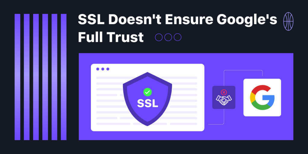
3. Privacy and Security Visuals
People care deeply about their personal information, and expect you to take that responsibility seriously. Websites that fail to show basic privacy and security indicators instantly create discomfort.
Here’s what you need:
- A visible SSL certificate (your URL should start with https://)
- A linked Privacy Policy in the footer
- A compliant cookie consent banner
- Security icons on forms or checkout pages
These visual markers don’t just meet legal requirements—they send a silent but powerful message: your data is safe here.

Branded Touchpoints That Reinforce Professionalism
Branded touchpoints are subtle but impactful things that communicate professionalism throughout your digital presence. From custom email addresses and considerate 404 pages to individual confirmation screens and microcopy, these pieces demonstrate consistency and care, fostering trust, establishing your brand identity, and leaving a lasting impact on your audience.
1. Custom Email Domains and Signatures
Your email communication is often your first direct contact with potential customers, and using a generic Gmail or Yahoo address can feel amateurish. A branded email (e.g., [email protected]) communicates that you’re serious about your business.
Equally important is the email signature. A complete signature should include:
- Your full name and job title
- Company logo
- Website URL
- Social media links
- Optional: a short tagline or scheduling link
This small detail can dramatically elevate the professionalism of your brand interactions.
2. Branded 404 Pages and Confirmation Screens
Most users will encounter a 404 page or a thank-you page at some point—and these are golden opportunities to reinforce trust. Don’t settle for the default “Page Not Found” message. Instead, design a branded 404 page that’s helpful, friendly, and even a bit on-brand quirky if appropriate.
Similarly, your thank-you pages (after contact form submissions, newsletter signups, or purchases) should do more than confirm receipt. Use them to add value—whether that’s offering next steps, additional resources, or a reassuring note about when to expect a reply.
3. Microcopy That Feels Human
Microcopy—those tiny bits of text on buttons, form fields, and error messages—play a surprisingly big role in trust-building. Instead of a cold “Submit,” use “Get My Free Estimate.” Rather than “Error 401,” try “Oops! Something went wrong. Let’s try that again.”
Every line of microcopy should reflect your brand personality and speak like a human, not a machine.
Design Features That Build (or Break) Credibility
Design elements play an important role in determining how trustworthy your website appears. Clean typography, strategic color use, and mobile adaptability can help your brand’s trust. Poor design decisions, on the other hand, might easily raise doubts, leading users to question your professionalism and leave your site.
1. Clean Typography Hierarchy
Poor typography isn’t just a design issue—it’s a credibility issue. A confusing jumble of fonts, irregular sizing, or poor contrast makes a site feel chaotic and unprofessional. Users should be able to scan headings and subheadings and immediately understand the structure of the content.
Invest in a type hierarchy:
- Limit yourself to two fonts
- Use consistent heading sizes
- Prioritize readability across all devices
A well-structured page reads like a well-organized thought.
2. Strategic Use of Color Psychology
Colors do more than decorate—they influence perception. For example, blue often signals trust and reliability, while red can signal urgency (or danger). Choose a palette that reflects your brand values and apply it intentionally across headers, links, buttons, and backgrounds.
Avoid overly vibrant or clashing color schemes unless they’re part of your brand personality. Instead, opt for contrast that enhances readability and evokes the right emotional tone.
3. Mobile-First Functionality
Most of your audience will interact with your site from a mobile device. If your site is slow, awkward to navigate, or cluttered on smaller screens, it instantly damages your credibility. A mobile-friendly site should:
- Load in under 3 seconds
- Feature large, tappable buttons
- Maintain legibility without zooming
- Offer a smooth scrolling experience
A flawless mobile experience isn’t optional—it’s a baseline expectation.
The Invisible Red Flags That Deter Potential Clients
Invisible red flags are subtle concerns that damage confidence and drive potential customers away. Broken links, obsolete information, generic stock pictures, and neglected footers may go unnoticed by you, but visitors pick them up right away. These minor errors might make your company appear careless or untrustworthy.

1. Broken Links and Outdated Pages
Nothing undermines trust faster than a “Page Not Found” error or an outdated blog from 2019. These silent red flags suggest that your business isn’t active—or worse, isn’t careful.
Routinely audit your site:
- Check for broken internal and outbound links
- Keep key pages updated (especially About, Contact, and Services)
- Archive outdated content or repurpose it into new formats
2. Generic Stock Photography
Trust is rooted in authenticity. Obvious stock photos—especially those overused corporate handshakes or posed smiles—don’t build a human connection. Use original photography whenever possible, or choose high-quality stock that feels genuine, candid, and on-brand.
3. Footer Neglect
Your footer isn’t just the end of a page—it’s your final handshake. A strong footer should include:
- Your business name and logo
- Contact info (phone, email, address)
- Links to privacy policy, terms, and key pages
- Social media icons
- A copyright that reflects the current year
This communicates thoroughness and care right to the bottom of the page.
Conclusion:
A modern, beautiful website is a fantastic start—but it’s only the beginning. Visitors need to feel that your business is real, capable, and secure. That feeling doesn’t come from aesthetics alone—it comes from intentional details: consistent branding, human-centered messaging, secure forms, mobile responsiveness, and authentic interactions.
Trust is what turns first-time visitors into long-term customers. If your website isn’t instilling that trust within the first few seconds, now’s the time to rethink and refine.
Design draws attention. Trust drives results. Make sure your website delivers both.